

What is capability and what is the meaning of cp and cpk ?
A blog by Dr. Uwe-Klaus Jarosch, August 2025
By a little more than 100 years it is evident to get good sayings about the quality of results in repeated processes by statistics.
The statistics expert Dr. Walter Andrew Shewhart is known as the inventor of Statistical Process Control (SPC).
In the year 1925 he introduced quality control cards. With this tool he enabled to measure the quality level and to improve quality from these data.
From mathematics, the main constraints and wordings have been known. Shewhart applied this field of mathematics for the first time to dedicated production processes.
Thereby, he became aware not necessarily to measure each and every part but to get reasonably safe results for the quality level by frequent, representative sample checks.
Aus der Mathematik waren die wesentlichen Zusammenhänge und Begriffe bekannt. Shewhart hat sie erstmalig auf konkreten Fertigungsprozesse angewendet.
Dabei hat er erkannt, dass es ausreicht, in regelmäßigen Abständen eine repräsentative Stichprobe zu untersuchen, um zu einer gesicherten Aussage über das Qualitätsniveau zu kommen.
Nowadays, statistics is used in many applications.
The result of the calculations will be condensed in many cases to one or two key figures, so called capability indicators.
The two most important indicators are cp und cpk.
The abreviations stand for
englisch capability of process.
The k in cpk is related to the japaneese word Katayori = Bias, shift. It is the indicator for the “tougher” index.
In practical applications you will find a couple of other abreviations, like pp (process performance), cm (machine capability) which will be calculated in indentical way.
Normal Distribution = Bell Curve
The first approximation to describe the distribution of measured values near to the calculated mean value is the Gauss’ian normal distribution. It is well known als bell curve.
20 years ago, this function jointly with the portrait of Gauss was displayed on every 10DM note in Germany.
In the picture below you see a bell curve on the right hand side.
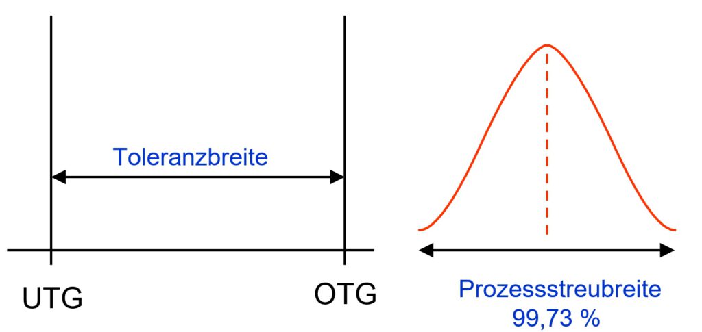
To understand this graph we need 2 information:
On one hand we need to know something about the width of the tolerance band (left picture). The tolerance width results from the distance of the upper tolerance limit (UTL, DE: OTG) to the lower tolerance limit (LTL, DE: UTG).
TW = UTL – LTL = OTG – UTG.
On the other hand we need measured values. The measurements will give any value and we expect most values in the band between the specification limits USL, LSL.
The horizontal axix of the graph will be sectionized in small sections. Then we count the number of measurement values fitting into each section. The number then gives a vertical position. Connecting these points will give the orange line.
With a natural distribution equivalent with the bell curve we find the largest number of measurement values in the center peak.
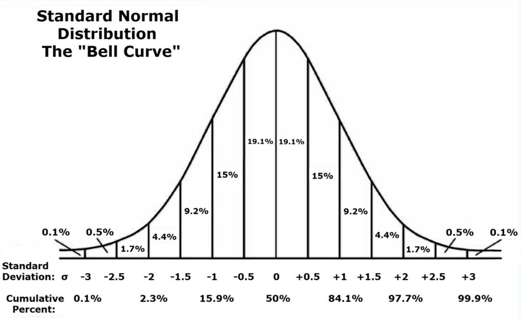
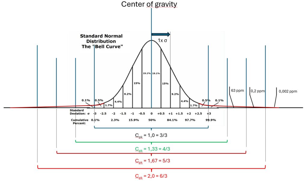
In the next picture we as well see a distribution of measured values. We can calculate a standard deviation for these values and its curve.
You find vertical lines in this 2nd graph for each half of the standard deviation Sigma stepping from the mean value in outside direction.
Furthermore, you see how many % of all measured values will be found in each section. Until we reach the 3x Standard Deviation Sigma lines we can count up 99.8%.
Now we need to overlay the distribution in the process and the tolerances.
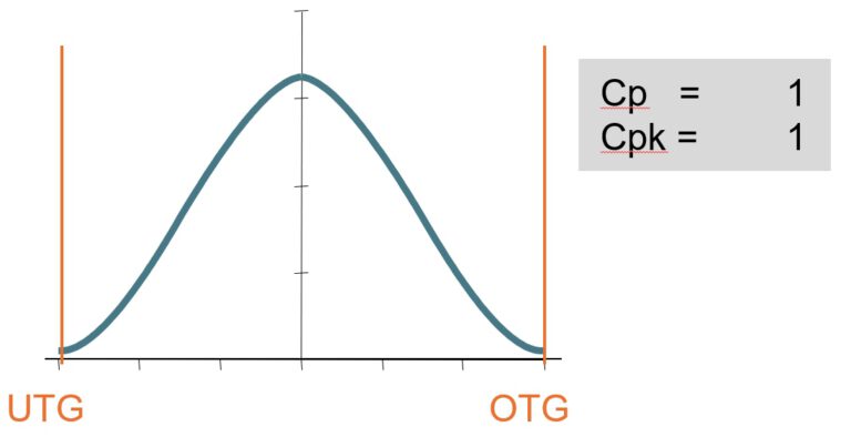
cp = cpk = 1,0.
If 99.8% are within the limits then 0.2% are outside.
For quality “Out of spec” means: this measured value and the related part or the measured state is not ok.
If you extrapolate the 0.2% it means to have 200 nok parts or nok states in 1 million measurements.
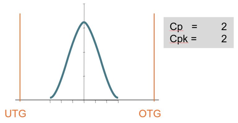
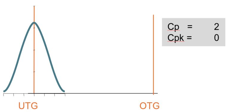
cp = cpk = 2,0.
In this graph the distribution of measured values again is perfectly centered to the limits. But you see a much slimmer peak. In this case, the standard deviation is only half as wide and would fit 6x on each siede of the center until you reach the limits.
The curve does not end at 3 Sigma. It continues endless but with very very small numbers. Almost all measurement values of the residual 0.2% now stay within the limits.
The exact values of residuals you find below.
cp refers to the width of the distribution
Was is the saying of cp ?
The calculation is easy: Tolerance width devided by 6x standard deviation Sigma.
Indifferent where on the x axix the distribution is placed, where ever the mean value is placed, the cp value will stay the same. The index only tells about the width in relation to the tolerance band. It tells about scatter.

cpk shows the number of NOKs as calculated statistically
cpk is different.
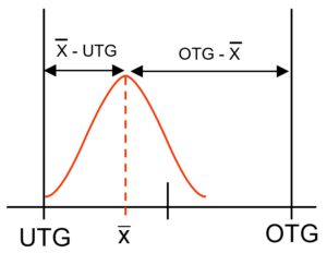
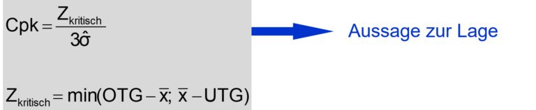
The formula to calculate cpk looks for the smallest distance between position of the mean value to one of the limits.
This means: a shift of the center or mean value will reduce cpk value, make it worse.
A good, a high cpk value shows 2 things: firstly , the peak of the distribution function is steep and slim. There is little scatter.
Secondly, the distribution of measurement values is well centered between the specification limits.
It becomes tighter and tighter
With cpk = 1,33 the residual number of events outside the specification limits is expected to be up to 63 Parts per million (PPM).
With cpk = 1,67 the number shrinks to ~0,6 PPM
and for cpk = 2,0 the expectation is 0,002 PPM, practically nothing.
Why do we talk about “up to” and not about precise numbers?
If we have an perfectly centered distribution and the curve drops symmetrically to both limits then the numbers are precise.
If we have a shift, a bias from the center of the tolerance range then only one side of the curve is near to the limit. On the other side we find additional ok-values. Overall we have less noks with a shift.
As higher the cpk index is expected, as higher as well cp is expected, as more effort you need to invest in your process to achieve in in a long run.
Automation will help.
100% inspection will not help if parts are not ok.
Then you find so many bad parts and measurement values near to the limits. In the calculation the standard deviation will become big and therefore, the capability index is low.
Or – to turn around the argumentation: The process is much to week, not capable and will not be able to safely produce good parts within given requirements.
The success path is to use closed loop processes: You do frequent measurements. Measurement values are within tolerance and the mean value of sequetial measurements is used in a controller to change process parameters in a way to push back the process results excactely into the middle of the tolerance band and to stay there with little scatter.
Conclusions:
- cp and cpk are based on an ideal distribution as described by the Gauss bell curve. Therefore, cp and cpk only deliver approximations of real distributions.
- cp and cpk are designed to handle two sided limited characteristics with a symmetrical distribution to the mean value.
- For bothe capability idices it is necessary to know the upper and lower specification limits for the tolerance range and to calculate the standard deviation from all included measurement values.
- cp gives an information about the “width” of the distribution function in relation to the tolerance range. It is irrelevant where the mean value is placed. cp has always a positive value.
- cpk as well is rating the width of the distribution function. But it takes the relation with the distances of the more near specification limit and the mean value. As more the mean value is walking out of the middle between the specification limits as smaller = worse the cpk number becomes. cpk can have negative value. Then the mean value no longer is placed between the specification limits.
Stay curious
Uwe Jarosch